Sunday 28 February 2010

Snow:Lab: Washout

Its been snowy here in Shetland recently, but that doesn't stop the Co:Lab team, even with our washout facilities out in the raw, freezing cold, elements...


The snow also came in handy for quickly washing off the squeegee. Never eat yellow snow, or red, or blue...
Snow:Lab Squeegy Cleaning

Wednesday 17 February 2010

Monster MASH-UP

The band
The co:lab studio this week had to contend with more than it's usual share of hairy beasts as we prepared ourselves to mash up some monsters.
Flash back two weeks, before civilization crumbled beneath our new monster regime…
Sitting around a Skippy table with a single sheet of A4, we set ourselves a brand new task. Our goal - to create three interchangeable monsters, creatures that we could butcher and reassemble into horrifying and ghastly abominations. Much like that beloved childhood card game where you would swap heads, torsos and legs resulting in hilarious combinations of body parts.
Taking our sheet of A4 and dividing it into thirds we marked the position and width of both the neck and the waist. Using these as our constraints - the points through which our monster must pass - we allowed our creations to evolve, safe in the certainty they would splice and graft together in hideous harmony.
The results, as you can see, are monstrous!
Co:lab mash-up
Ziggle zaggle zoggle

Co:Lab - Monsters

The Co:Lab team was hijacked last night, during the printing of our next project: Monsters. View the video below to see the carnage and view the latest set of prints from the team.

Co:Lab - Monsters from Co:Lab on Vimeo.

Saturday 13 February 2010

CoLab - Adverts

Co:Lab have been busy during the last week printing the second Co:Lab project, Adverts. The brief - Each member should create an A4 advert suitable for two colour printing in the given timescale of one week. The product, concept, ideal or whatever we set out to promote was entirely ours to choose.

The outcomes with links to in depth blog about process:

Philip Eight raw umber/fluorescent pink
(above) Andrew - Philip Eight - A Fragrance for Men - Process Blog by Andrew.
Co:Lab Ad
(above) Jono - Ad Revamps - Finding existing ads for second hand goods & redesigning them - Process Blog by Jono.

(above) Beto - Bubblewrap Sandwich - With an extra loud bite - Process Blog by Beto.

Friday 12 February 2010

A loud bite to close a busy week

Thursday night was Beto's print night, closing off the second Co:Lab assignment, and with Andrew and Jono's prints already blogged and shining on Flickr, the pressure was on!

Following the guidelines provided - create a two colour advert in a week - Beto's idea was to promote a fictious food product, in a slightly old fashioned way...

The original idea evolved somehow from this: glass onion (White Album; Beatles) - glass sandwich (an unpublished book by Robert Smith; The Cure) - glass/food - any material/food = Bubblewrap Sandwich!

Once the idea was executed on paper (pencil and ink), Beto used Illustrator to clean it up and pass it into Manga Studio, a software he is familiarising himself with. "I like how easy traditional halftones can be applied and tweaked in Manga Studio. I wanted to use halftone for two reasons; One is that it gives an instant old fashion mechanical print look. The other reason was to achieve the type of effect you see in money". While playing in Photoshop testing colors for the print, Beto encountered the green/blue combination, giving the print the look of an old note or very old postal stamps.

The session went smoothly, and between work and jokes, we had a look at two books - Print Liberation and Meet Mr Product - both recommendable and available for just over a fiver. The later containing a picture of the Bazzoka bubble gum logo that brought memories to the older members of the team and illustrated that play with colors, halftones and off register layers that Beto was looking for from his print.

Colour variants:


Test prints:


Overall a fun session with some visitors, some of Jono's best ever cups of tea and some very satisfying prints to close a busy week that should see the Co:Lab team ready for thee monstrous task ahead.

Wednesday 10 February 2010

Let Co:Lab help turn your spare cash into trash

After the dramatic set backs from our first print session last night, Co:Lab had a more relaxing print session tonight, continuing with the second Co:Lab project, Adverts. With 500w bulbs for our lamps, of course.

In the set timescale of one flexible week, each Co:Lab member was to create a two colour advert with the freedom to advertise absolutely anything we wanted.

We got quickly set to print the second of the set, Jono's reply to the brief - "Ad Revamps":
The concept was to take existing adverts and classifieds found in newspapers/shop windows/signs, which are selling second hand goods, and redesign them.

Jono discovered a few ads he felt fit the bill, such as one selling a "Geto Blaster" (spelling as original ad) also a car costing only "15£" (again direct quote from original ad) but quickly got inspired with an advert for a "Gas Cooker" with "Four Hobs", which became the final print. With extra time from the early burst of inspiration Jono decided to take on the other two ads as well, with scope for an ongoing ad revamp project. (Geto Blaster + Car below - Digital versions)


The printing of Jono's final advert went relatively without a hitch, taking on board some Co:Lab colour theory learnt from the previous night - namely the orange shown below, which we realised from some of Andrew's test prints.
Co:Lab Ad
Again, we took some time to experiment with some other variants and even learning to not get too excited about mixing colours to forget to dry screen before printing.
Co:Lab Ad
Co:Lab Ad
And finally a one off - a possible colour choice for a scary Co:Lab project coming soon.
Co:Lab Ad test
And after that, another screen coated and ready for Beto's tasty submission tomorrow!

New Prints – Co:lab sell out to the man

Philip Eight Multicolours 
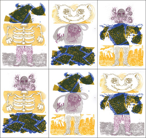
It was a heavy night of printing last night as we set about the second of our co:lab team tasks. The brief we set ourselves this time was to create, within the space of a week (give or take allowances for general real life shenanigans), an A4 advert suitable for two colour printing. Those were our only spec. The product, concept, ideal or whatever we set out to promote was entirely ours to choose.
The eagle-eyed among you will see from the accompanying images that we only finished one of the three prints. We'd set out to complete two with the third planned for this evening (together with the beginnings of co:lab 3). Problems plagued us however, succeeding in blowing the bulbs in both of our halogen lamps. The first one (jono's) flickered and died 11 minutes into the 17 minute exposure of our first screen. A quick spin out to Scalloway to pick up Andrew's lamp allowed us to bundle on those last six minutes and to our relief the screen washed out perfectly and was good to use.
The second screen was less fortunate as, during exposure, the second lamp suffered a similar fate to the first... this time after only four minutes! Having no third lamp to fall back on Beto and Andrew spun off on a fruitless search for bulbs and returned empty handed. Fortunately Papa Sandilands came to the rescue with both 300w and 200w bulbs and game was back in play. To no avail however as, come washout time, all the emulsion bled from the screen leaving no trace of a template to print with.
Left with just the one workable screen we set about making the most of the evening.
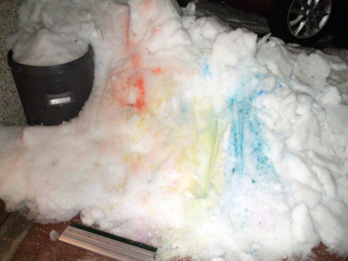
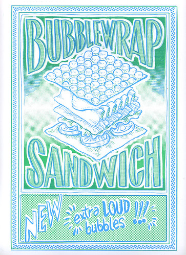
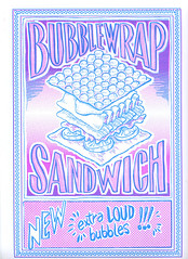
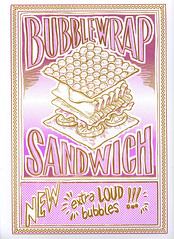
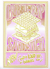
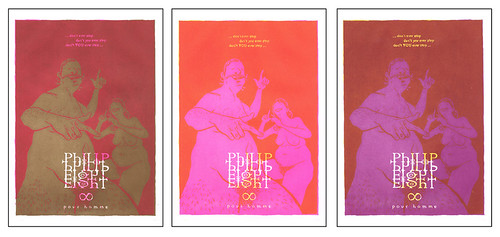
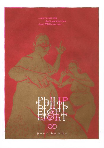
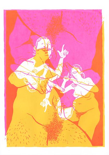
Philip Eight – A Fragrance for Men is Andrew's contribution to the Advertisement task. Although originally conceived as an initial yellow layer plastered over with a second black layer inspiration kicked in and Andrew decided to try out the florescent pink, caking it in a second coat of raw umber. The pink was magnificent and when shining through the raw umber the colours joined in a deep regal red.Philip Eight raw umber/fluorescent pink
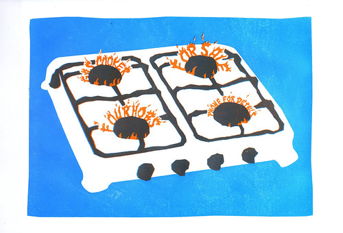
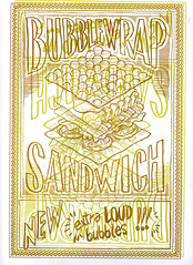
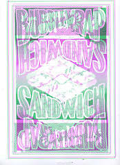
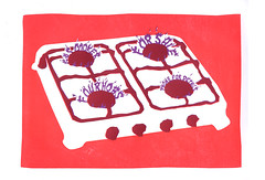
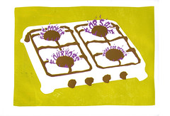
As this was the only print we had to work on we decided to plough on and try a variant on the initial yellow idea... unwittingly treading on the same error we'd made first time around with the screw picture from co:lab 1b. Yellow, it appears, is a remarkably difficult colour to work with when overlapping colours. It seems to lack punch and struggles to hold definition. We printed 21 sheets with a base colour yellow and proceed to work through 4 alternatives (many of which delivered oddly hazy results) before getting excited about the blend of the yellow with the florescent pink which we had stumbled upon earlier in the process while fooling around.Philip Eight experimental art
It was a late finish but we got some great prints in the end and have tucked away a fine catalogue of colour theory which should prove useful in future.
We're planning to attack Jono's piece tonight so check back in with us soon for the further adventures of co:lab!

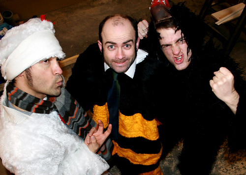
Addendum: Having seen the workings for these prints Philip Eight has ask Andrew to become his official biographer and over the coming months his life will be documented in pictures at philipeight.blogspot.com.

Thursday 4 February 2010

Co:Lab - Sideways (BBC Radio Shetland) feature

Hear us speaking about our exhibition and work @ Bonhoga cafe on BBC Radio Shetland's 'Sideways' programme from Thursday 4 February. Big thanks to the Sideways team for letting us on their show! Click the link to listen to the show - we're on around 10 mins in - available for a week...

http://www.bbc.co.uk/radio/aod/scotland_aod.shtml?scotland/shetland_thu

Amy mentioned a video of us at work which can be found here...
How we print timelapse.